Position
In this lesson, we will delve into how to position HTML elements using Tailwind CSS's position utility classes. Tailwind provides a suite of utility classes designed for precisely controlling the positioning of elements. These include classes for static, fixed, absolute, relative, and sticky positioning.
Position Attribute in CSS
The position attribute in CSS defines how an element is positioned within the Document Object Model (DOM). It determines the element's layout behavior and can take values like static, fixed, absolute, relative, and sticky. Each value affects how an element is displayed and interacts with other elements on the web page.
Tailwind CSS provides utility classes to control an element's position in the DOM. Here are the relevant classes:
- static: The default position value. Elements with static positioning follow the normal document flow and are not affected by top, right, bottom, or left properties.
- fixed: Elements with fixed positioning are positioned relative to the viewport and do not move with page scrolling. They remain in a fixed position on the screen.Examples of fixed components include: Fixed Navigation Bar, Floating Action Button, and Persistent Sidebars.
- absolute: Elements with absolute positioning are positioned relative to their nearest positioned ancestor, often with specified top, right, bottom, or left values. They are removed from the normal document flow.A "positioned ancestor" refers to an element in the HTML document hierarchy that has a position property other than the default static value.
- relative: Elements with relative positioning are positioned relative to their normal position in the document flow. They can be shifted using top, right, bottom, or left properties without affecting other elements' positions.
- sticky: Elements with sticky positioning act like they're "glued" to their container as you scroll. They stay where they are within the container until they reach a certain point. Once they reach that point, they become fixed, and they'll stick in place even when you continue scrolling, but only until the container scrolls out of view. It's like a temporary "stick" in a specific spot as you scroll.Examples of sticky components include: Sticky Table Headers, Sticky Navigation within a Container, Sticky Call-to-Action Buttons
Examples
a. absolute and relative elements
In the following example, we showcase the use of absolute positioning in Tailwind CSS. We display a 'New Arrival' tag at the top-right corner of a product card by applying the absolute, top-4, and right-4 classes to the tag's div element.
Notably, the container div of this tag has a relative class, creating a positioning context. As a result, the 'New Arrival' tag adjusts its position relative to its parent relative div, allowing for precise placement within the card.
Code block
<div className="max-w-md mx-auto bg-white rounded-lg overflow-hidden shadow-lg relative"> <div className="p-4"> <h2 className="text-2xl font-semibold mb-2">Premium Leather Jacket</h2> <p className="text-gray-600">Elevate your style with our Premium Leather Jacket. Crafted from genuine leather, this jacket offers both fashion and functionality for any occasion. Stay warm and look sharp this winter.</p> </div> <div className="absolute top-4 right-4 bg-red-500 text-white px-2 py-1 rounded"> New Arrival </div> </div>
b. fixed elements
In this example, we've placed a WhatsApp link button at the bottom-right corner of the webpage. This button remains fixed to the viewport, staying visible even as you scroll down the page. This user-friendly approach ensures that visitors can easily reach out to us with any queries or messages, as the contact option is conveniently accessible at all times.
Code block
<a href="https://wa.me/1234567890" target="_blank" className="fixed bottom-4 right-4 bg-green-500 text-white px-4 py-2 rounded-full shadow-lg hover:bg-green-600"> <svg xmlns="http://www.w3.org/2000/svg" className="h-6 w-6 inline-block mr-2" fill="none" viewBox="0 0 24 24" stroke="currentColor"> <path stroke-linecap="round" stroke-linejoin="round" stroke-width="2" d="M3 3a2 2 0 012-2h14a2 2 0 012 2v18l-4-4H5a2 2 0 01-2-2V3z" /> </svg> WhatsApp </a>
c. sticky header
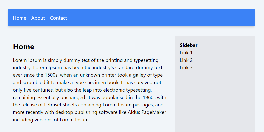
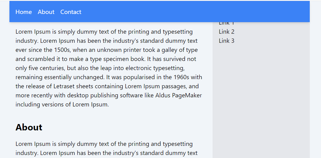
In this example, the header has been assigned the sticky class. This makes it behave as a relatively positioned element when the page is not scrolled. However, as you scroll through the webpage, the header becomes fixed and remains visible at the top.
Code block
<div className="sticky top-0 bg-blue-500 text-white p-4 shadow-md"> <nav> <a href="#home" className="mr-4">Home</a> <a href="#about" className="mr-4">About</a> <a href="#contact">Contact</a> </nav> </div> <div className="flex mt-8"> <div className="flex-1 p-4"> <section id="home"> <h2 className="text-2xl font-bold mb-4">Home</h2> <p>....</p> </section> <section id="about" className="mt-8"> <h2 className="text-2xl font-bold mb-4">About</h2> <p>....</p> </section> </div> <div className="w-64 bg-gray-200 p-4"> <h3 className="font-bold">Sidebar</h3> <ul> <li>Link 1</li> <li>Link 2</li> <li>Link 3</li> </ul> </div> </div>When not Scrolled

When Scrolled

In this lesson, we explored various positioning attributes that can be applied to elements in web design. These positioning attributes, including static, relative, absolute, fixed, and sticky, offer powerful and versatile methods for arranging and aligning elements on a webpage. Understanding and correctly applying these attributes is crucial for effective web design, as they allow for precise control over the layout and behavior of elements in response to user interactions or browser window changes.
In this lesson, we will examine how to manage the visibility of elements. Additionally, we will gain a clear understanding of the distinction between making an element invisible and hidden.
All Modules