Border Between Elements - Divide Classes
In this lesson, we will explore Tailwind CSS divide classes, which provide us with precise control over the widths, styles, and colors of separations or divisions between items within a container. These classes empower us to create visually appealing and well-organized layouts by customizing the dividers between elements.
Tailwind CSS's divide utilities are designed to set the border between child elements of a flex or grid container. This is particularly useful for creating consistent spacing between items in a list or grid without having to apply border styling to each individual item. Here's an explanation of these classes using a pattern method:
1. Divide-width Classes
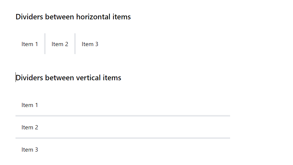
- divide-x-{size}: This utility sets the horizontal border width between child elements of a container. The {size} refers to the width of the divider. For example, divide-x-2 applies a 2px wide border between each child element along the x-axis (horizontally).
- divide-y-{size}: Similar to divide-x, this class is used for vertical spacing between items. divide-y-2 would add a 2px wide border between each child element along the y-axis (vertically).
Divider Width
The {size} in divide-x and divide-y can be one of the standard spacing sizes in Tailwind, such as:
- 0: No divider (0px).
- 1: Very thin divider (1px).
- 2, 4, 8: Increasingly wider dividers (2px, 4px, 8px, respectively).
Here's how you might use these classes in HTML:
In the first example, divide-x-4 adds a 4px wide vertical border between each flex item. In the second example, divide-y-4 creates a 4px wide horizontal border between each flex item.
Code block
<div className=''> <div className='w-1/2 my-10 flex flex-col gap-6'> <h2 className='my-2 font-medium text-xl'>Dividers between horizontal items</h2> <div className="flex divide-x-4"> <div className='p-4'>Item 1</div> <div className='p-4'>Item 2</div> <div className='p-4'>Item 3</div> </div> </div> <div className='w-1/2 my-10 flex flex-col gap-6'> <h2 className='my-2 font-medium text-xl'>Dividers between vertical items</h2> <div className="flex flex-col divide-y-4"> <div className='p-4'>Item 1</div> <div className='p-4'>Item 2</div> <div className='p-4'>Item 3</div> </div> </div> </div>
2. Reversed Dividers
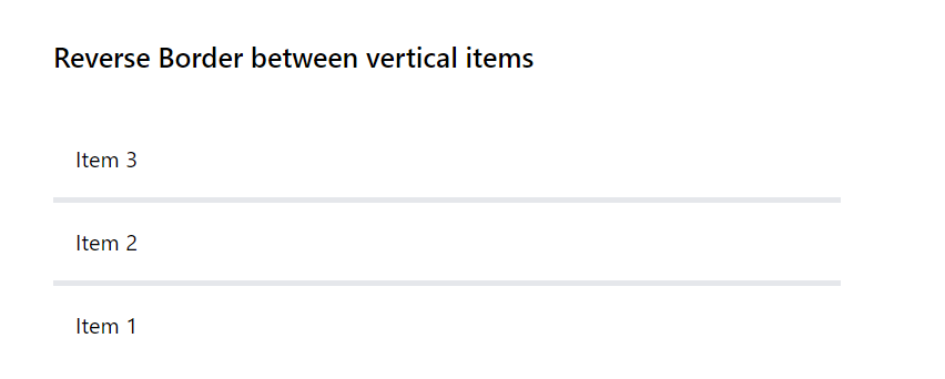
Tailwind also includes divide-x-reverse and divide-y-reverse classes to reverse the order of divided borders. These can be useful in certain layout designs where the items are in reverse order (using flex-row-reverse or flex-col-reverse)
Horizontal Divider with Reverse
This example demonstrates a horizontal row of items with dividers, where the divider's direction is reversed. In this example, divide-x-4 sets a 4px wide vertical border between each flex item. The divide-x-reverse reverses the order of these dividers.
Code block
<div className='w-1/2 my-10 flex flex-col gap-6'> <h2 className='my-2 font-medium text-xl'>Reverse Border between horizontal items</h2> <div className="flex flex-row-reverse divide-x-4 divide-x-reverse"> <div className='p-4'>Item 1</div> <div className='p-4'>Item 2</div> <div className='p-4'>Item 3</div> </div> </div>
Vertical Divider with Reverse
This example shows a vertical column of items in a grid layout, with reversed divider direction. Here, divide-y-4 creates a 4px wide horizontal border between each flex item. The divide-y-reverse reverses the order of these dividers.
Code block
<div className='w-1/2 my-10 flex flex-col gap-6'> <h2 className='my-2 font-medium text-xl'>Reverse Border between vertical items</h2> <div className="flex flex-col-reverse divide-y-4 divide-y-reverse"> <div className='p-4'>Item 1</div> <div className='p-4'>Item 2</div> <div className='p-4'>Item 3</div> </div> </div>
Notes on Usage
- The reverse classes (divide-x-reverse and divide-y-reverse) don't change the layout of the items themselves but only the visual placement of the dividers.
- These classes are particularly useful in designs where the visual flow of elements needs to be distinct from their logical order, such as in certain RTL (Right-to-Left) layouts or specific design requirements.
3. Divide Style Utility Classes
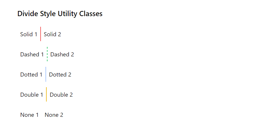
Tailwind CSS's divide-style utilities are designed to set the border style of the dividers between child elements in a flex or grid container. This is especially useful for creating distinct visual separations between items in a list or grid without having to add individual borders to each element.
- divide-solid: This utility applies a solid border style between child elements. It's the equivalent of setting border-style: solid; in traditional CSS.
- divide-dashed: Sets a dashed border style for the dividers. This style is represented as a series of short dashes.
- divide-dotted: Applies a dotted border style, which consists of a series of dots.
- divide-double: This creates a double border style, where two parallel lines with some space between them are used as the divider.
- divide-none: Removes the divider by setting the border style to none.
Code block
<div className="flex flex-col gap-4"> <h2 className='my-2 font-medium text-xl'>Divide Style Utility Classes</h2> {/* <!-- Solid Divider --> */} <div className="flex divide-x-2 divide-solid divide-red-500"> <div className="p-2">Solid 1</div> <div className="p-2">Solid 2</div> </div> {/* <!-- Dashed Divider --> */} <div className="flex divide-x-2 divide-dashed divide-green-500"> <div className="p-2">Dashed 1</div> <div className="p-2">Dashed 2</div> </div> {/* <!-- Dotted Divider --> */} <div className="flex divide-x-2 divide-dotted divide-blue-500"> <div className="p-2">Dotted 1</div> <div className="p-2">Dotted 2</div> </div> {/* <!-- Double Divider --> */} <div className="flex divide-x-2 divide-double divide-yellow-500 "> <div className="p-2">Double 1</div> <div className="p-2">Double 2</div> </div> {/* <!-- None (No Divider) --> */} <div className="flex divide-x-2 divide-none"> <div className="p-2">None 1</div> <div className="p-2">None 2</div> </div> </div>
4. Divide Color Utility Classes
Tailwind CSS's divide-color utilities allow you to specify the color of the dividers between child elements within a flex or grid container. Here's an explanation of these classes:
Basic Divide Color Classes
- divide-{color}-{shade}: Sets the color of the dividers between child elements. The {color} is the color name, and {shade} represents the intensity or lightness of the color. For example, divide-red-500 applies a medium red divider color.
- divide-current: Applies the current color of the element to its dividers. This means the divider color will be the same as the text color (color property) of the element.
- divide-transparent: Makes the divider color transparent.
- divide-black and divide-white: Sets the divider color to black or white, respectively.
Tailwind Color Palette
Tailwind provides a wide range of colors, each with different shades. The pattern for using these colors in divider utilities is divide-{color}-{shade}. The color names include gray, red, yellow, green, blue, indigo, purple, and pink. The shade ranges typically from 50 (lightest) to 900 (darkest).
Examples
Here are three examples that demonstrate the use of Tailwind CSS's divide-width, divide-style, and divide-color classes. These examples will help you to understand how these classes work together to style dividers between elements in a container.
Example 1: Using Divide Width and Color
This example shows how to use divide-width and divide-color classes together. The following code creates a horizontal flex container with three items. It uses divide-x-4 to set the divider width to 4px and divide-red-500 to color the dividers red.
Code block
<div className="flex flex-col gap-4 my-10"> <h2 className='my-2 font-medium text-xl'>Using Divide Width and Color</h2> <div className="flex divide-x-4 divide-red-500"> <div className="p-4">Item 1</div> <div className="p-4">Item 2</div> <div className="p-4">Item 3</div> </div> </div>
Example 2: Combining Divide Style and Color
This example demonstrates how to combine divide-style and divide-color. The dividers are styled with divide-dashed to create dashed lines and divide-blue-300 for a light blue color.
Code block
<div className="flex flex-col gap-4 my-10 w-1/2"> <h2 className='my-2 font-medium text-xl'>Combining Divide Style and Color</h2> <div className="flex flex-col divide-y divide-dashed divide-blue-300"> <div className="p-4">Item 1</div> <div className="p-4">Item 2</div> <div className="p-4">Item 3</div> </div> </div>
Example 3: Utilizing All Three Classes
In this example, all three classes (divide-width, divide-style, and divide-color) are used together. The following code creates a wrapper with flexbox and wrap. Each item spans the full width of its container. The dividers are 2px wide (divide-y-2), double-styled (divide-double), and colored green (divide-green-600).
Code block
<div className="flex flex-col gap-4 my-10 w-1/2"> <h2 className='my-2 font-medium text-xl'>Utilizing All Three Classes</h2> <div className="flex flex-wrap divide-y-2 divide-double divide-green-600"> <div className="w-full p-4">Item 1</div> <div className="w-full p-4">Item 2</div> <div className="w-full p-4">Item 3</div> </div> </div>
In this lesson, we will delve into the Tailwind CSS outline classes. To begin, we'll clarify the distinction between borders and outlines. Afterward, we'll explore the diverse methods available for styling and coloring outlines, equipping you with the knowledge to enhance the visual presentation of your web elements.
All Modules