Space Between Child Elements
In this lesson, we will explore the concept of adding consistent spacing between items within a container. These spacing utilities are extremely helpful for achieving well-organized and visually appealing layouts, allowing you to control the distance between elements effectively.
In Tailwind CSS, the "Space Between" classes allow you to control the spacing between child elements of a parent container. These utility classes are incredibly useful for evenly distributing space in horizontal or vertical stacks of elements. The classes work by applying a margin to all child elements except the first (for horizontal spacing) or the top-most (for vertical spacing).
Horizontal Spacing (space-x-{size}):
space-x-{size}: This class is used on a parent container to control the horizontal space between its immediate children. The {size} determines the magnitude of the space.
In the following example, there will be 1rem of horizontal space (since 4 in Tailwind equals 1rem) between each child div inside the flex container.
Code block
<div class="flex space-x-4"> <div>Child 1</div> <div>Child 2</div> <div>Child 3</div></div>
Vertical Spacing (space-y-{size}):
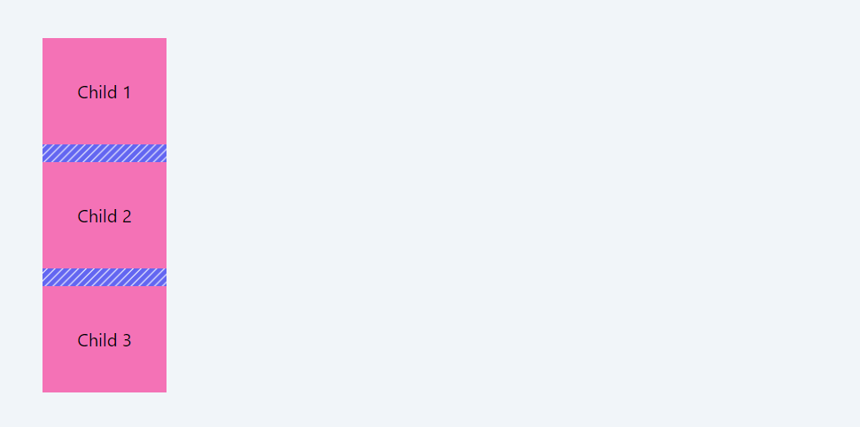
space-y-{size}: Similar to space-x, but for vertical spacing between child elements.
In the following example, there will be 1rem of vertical space (as 4 usually equals 1rem in Tailwind) between each child div.
Code block
<div class="flex flex-col space-y-4"> <div>Child 1</div> <div>Child 2</div> <div>Child 3</div></div>
Responsive Variants
Like many other utilities in Tailwind, space-between classes can be made responsive by prefixing them with a breakpoint name.
Code block
<div class="flex flex-col space-y-2 md:space-y-4"> <div>Child 1</div> <div>Child 2</div> <div>Child 3</div></div>In this case, the vertical spacing is 0.5rem on small screens, and it increases to 1rem on medium-sized screens and larger (md:space-y-4).
Negative Spacing:
Tailwind also offers negative space utilities (-space-x-{size} and -space-y-{size}) to bring child elements closer together than their default spacing would allow.
Usage Notes:
- The space between classes only affect the immediate children of the container they are applied to.
- These utilities are particularly useful in flexbox (flex) and grid (grid) layouts.
- The actual spacing size ({size}) should be chosen based on Tailwind's default spacing scale, or any custom scale defined in your Tailwind configuration.
- "Space Between" classes offer a convenient and consistent way to manage layout spacing, ensuring visual harmony and alignment in design.
Reverse Spacing
The space-y-reverse and space-x-reverse classes in Tailwind CSS are used in combination with the space-y-{size} and space-x-{size} classes to reverse the direction of spacing between child elements. These classes are particularly useful when you want to change the visual order of elements without changing their DOM order.
space-y-reverse:
Usage: When combined with space-y-{size}, it reverses the vertical spacing direction.
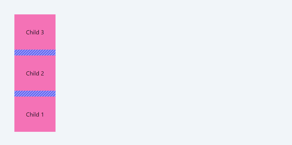
In this layout, the items are reversed using the flex-col-reverse class, so in order to have proper spacing between the elements, space-y-reverse is used.
Code block
<div class="flex flex-col-reverse space-y-4 space-y-reverse"> <div>Child 1</div> <div>Child 2</div> <div>Child 3</div></div>
space-x-reverse:
Usage: When combined with space-x-{size}, it reverses the horizontal spacing direction.
Code block
<div class="flex flex-row-reverse space-x-4 space-x-reverse "> <div>Child 1</div> <div>Child 2</div> <div>Child 3</div></div>
Usage Notes:
- These classes are particularly useful in RTL (Right-to-Left) layouts or when the visual order needs to be opposite of the flow in the source code.
- They don't reverse the order of the elements themselves, just the direction of the applied margin.
In this module, we delve into the core layout systems of flexbox and grid, highlighting their significance in modern web design. We'll explore how Tailwind CSS utility classes make these powerful layout tools accessible and straightforward to implement, enabling the creation of complex and responsive designs with ease.
All Modules